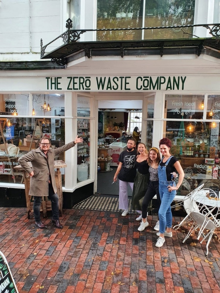
Interior Design Masters host Alan Carr was bowled over by his trip to the Tunbridge Wells Pantiles last year, as we saw in the Times’ report of September 30 and in Tuesday night’s show.
“Tunbridge Wells… Oooh, look a this, look how posh it looks!” he enthused. And armed with a bundle of local shopping bags in The Pantiles, he exclaimed: “I’m supporting the local high street, and I’m about to support the local wine bar!”
But many viewers were quick to spot a major gaffe early in the show as a misspelt sign flashed up saying: Royal ‘Tonbridge’ Wells. The famed Disgusteds of ‘Tunbridge’ Wells came out in force to defend the spelling of their town on social media.
Patrick Howse said: “That’s worse than when Alan Titchmarsh said that Knole was ‘near’ Sevenoaks.” Someone else suggested writing it out correctly 100 times.
But clangers aside, the show saw six remaining contestants briefed on this week’s design task.
Head Judge Michelle Ogundehin (former Editor-in-Chief of Elle Decoration magazine) warned: “It might be their biggest challenge, yet. Independent stores are having a really hard time right now, so we are moving into the world of retail.”
Character shops are definitely dear to the hearts of Tunbridge Wells, and commenting on the retail crisis in general, she later said: “I think actually shops are probably, right now, our hardest challenge ever.”
Working in pairs, each of the designers had to come up with their own ideas and pitch them to the shop owners, who would then choose the ideas they liked. Then, with £3,000 to spend, they would have just two days to do the work.
At the end of the show, the judges (Michelle and this week’s guest judge, pop-up retail guru Ross Bailey) would decide the winner. Out of the remaining four, Michelle would decide who had done worst and be sent home. Always the most nail-biting, teeth-grinding moment!
Michelle outlined to Alan the most important things the designers should remember: “With any shop design, it’s about window display, it’s about getting them through the door, it’s about keeping them in the shop. Because shopping online is so easy these days, physical shops have got to be so much more than just a shop, they have to be a place where people can hang out and meet other like-minded people.”
Pantiles Camera Director David Podbury explained what he wanted for his shop to designers Barbara and Lynsey: “We moved in, I think, about 1984 and the world has changed, so people would like to come in to discuss and use our advice more rather than just a sale. But the shop is tired, it has to be more attractive than it is right now.”
Trevor Mottram’s Sarah and Alan Wood warned Paul and Micaela they had ‘an absolutely huge range’, which as anyone who has wandered this Aladdin’s Cave in wonder, gazing at thousands of kitchen items, will know. Men, in particular, just loved it!
Said Sarah: “I’d like a little bit more space. I’d like the displays to be better and cleaner with better shelving and things like that.”
Paul suggested something quirky on the ceiling – which turned out to be an upside down Alice in Wonderland-style tea table and 200 hanging spoons! “Something that somebody’s going to come in, take a snap of and put it on their social media.”
And Collared’s Catherine Parr told Charlotte and Siobhan: “What I wanted was to keep the storage in the shop, and it is really difficult, we have so many things. But I do want it to change, so I like the idea of introducing a new kind of colour scheme.”
The designers went for a ‘vintage heritage vibe’, but sadly failed to pull off the best idea of the lot – a big central display table shaped like a dog’s bone. However, we did end up with a giant, hairy, shocking pink Afghan hound in the window!
Quipped Alan when looking around: “This was very Royal Tunbridge Wells, and it feels a bit classy and you’re going to get like a posh dog going around.”
And due to a mass of new shelves, Pantiles Cameras very nearly didn’t get finished!
When the judges arrived they loved the Collared shop front and cat wallpaper, but there was much hilarity on social media at Ross’s question: “What is the journey of the dog that’s coming in here?”
The conversation grew even more bizarre when they started talking about a pet area where you could take a selfie with your dog. Michelle suggested it could be gated so the dogs could have ‘little play dates’ (!)
“Where was the thought for the dog, the dog is the customer here.”
Despite the panic, Pantiles Cameras ended up transformed with a clever studio area at the back and a little seat and coffee table where clients could sit down to be given advice. But, to the judges’ horror, no cushions! “Where is the comfort?” Michelle said, aghast.
And at Trevor Mottram’s, the ‘super cute little shop front’ and large upside-down colander lights were a big hit, along with the super-stylish new wallpaper and resin counter top. But Ross hated the ceiling spoons.
Back at Michelle’s London HQ it was tense decision time. Alan told the contestants that the owners of the winning shop were ‘blown away’.
“They loved the window display and the innovative lighting, but they especially liked some of the fun and quirky touches.” It was Trevor Mottram’s. (Oddly, we didn’t hear what the other shop owners thought!)
Summing up what’s needed to boost independent shops, Ross said: ”What makes it great is personality… What makes a store so interesting is where it tells an incredible story when you learn about the person behind the product… what you can’t get online.”
Michelle commented: “Retail is about a series of moments… shopping is about keeping people in the shop.”
And on her decision about who should leave the competition: “To me this comes down to which is the greater crime – to have missed out a bit of decoration or to have forgotten the customer?”
“Ultimately, in an online era, retail has got to be about emotion, feeling, community, drawing people in keeping them there, giving me everything that I cannot get from online.”
When popular contestant Barbara was sent home for not thinking about those cushions, there was outrage online. “Barbera was the best one!! Robbed,” said @Emzie76.
“Barbara?? Barbara??? See this is why this programme gives me anxiety,” said @MultiTaskingCat
You can read all the social media comments for yourselves under the hashtag:


